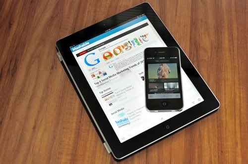
Yesterday Google released their new news reader called Google Currents. If you are an iOS user, you probably already know Flipboard, which is similar to Google’s offer (sort of). I’ve been using it for a day and since I am a heavy Flipboard user, I can compare and give you some details on what’s what.
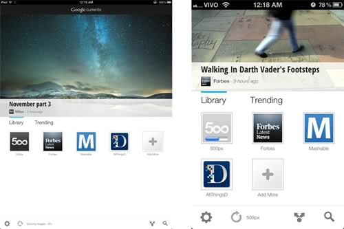
The look and feel for both apps (iPad on the left, iPhone on the right) is very similar. The design is very clean and functional. As for content, Google launched the service with 150 partners. That’s a fairly good amount of content, plus all the RSS feeds you may want to get from your Google Reader account. I miss some essentials for me, like the New York Times and The Economist, but the selection is decent enough for a starter. The only annoying thing is that you cannot add a RSS feed directly to your Library (at least I couldn’t find how). You have to go to Google Reader, add it there and then add the feed to your Library.
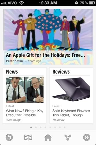
The app is also read-only. So you can see the 500px photos, but you cannot comment or vote on the images, like in Flipboard. You also can’t add streams of social networks, like Twitter of Facebook, the same way Flipboard does. The purpose of this app seems to be clearly to aggregate news. And it does that quite slowly, by the way. The app seems to be always syncing something. On wifi, it’s just annoying, but on 3G, it makes your device very hot and drains its battery really fast. Either the sync policy is terribly bad scaled, or the content format for this app is bloated. Anyway, Google needs to address this issue.
Composition-wise, I prefer this app over Flipboard. It’s cleaner and easier to find what you need. Navigation is somewhat slow — it takes a few hundred milliseconds to open the next page once you click an item on an iPad 2, which is very noticeable. In this regard, it isn’t as fluid as Flipboard, which has sleek animations and works lightning fast.
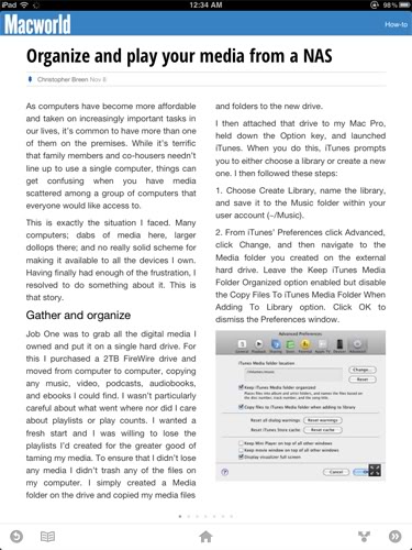
The article pages are very well composed and the use of sans-serif fonts make them easier to read on a LCD screen when compared to Flipboard. By the way, some fonts used on headlines on the feeds pages look suspiciously similar to Windows Phone 7’s SegoeWP.
One thing that Google should try to exploit is the use of multitouch gestures, like Flipboard does. Having to click a home or a back button on screen is annoying. Pinching and flipping are much more natural in multitouch displays.
Overall, the app looks good. It needs more content and some interface tweaks, but it’s polished enough for a first version. For iOS users, I still recommend Flipboard over this, since it has more content, it’s more flexible, has less bugs, and has a better interface. Android users, on the other hand, will find Google Currents a great addition to their devices — as long as they live in the U.S., since it’s the only place this seems to be working right now.