Google has finally realized it needed an app specifically made for tablets and, during the last Google I/O conference, the company announced it was coming for both Android and iOS. Yesterday, the Google+ iPad app started to roll out in the App Store. Here are some impressions.
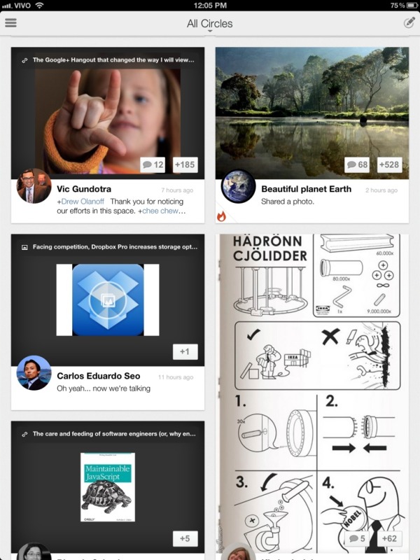
The first thing you will notice is that it looks very familiar to another Google app: Currents. This is a good thing, as Google Currents actually looks beautiful. The typography is good, text is easy to read and the posts layout is well done most of the time (more on that later). The iPad version also features smart use of pinch gestures to navigate through posts.

The main feed looks consistent with other Google apps.
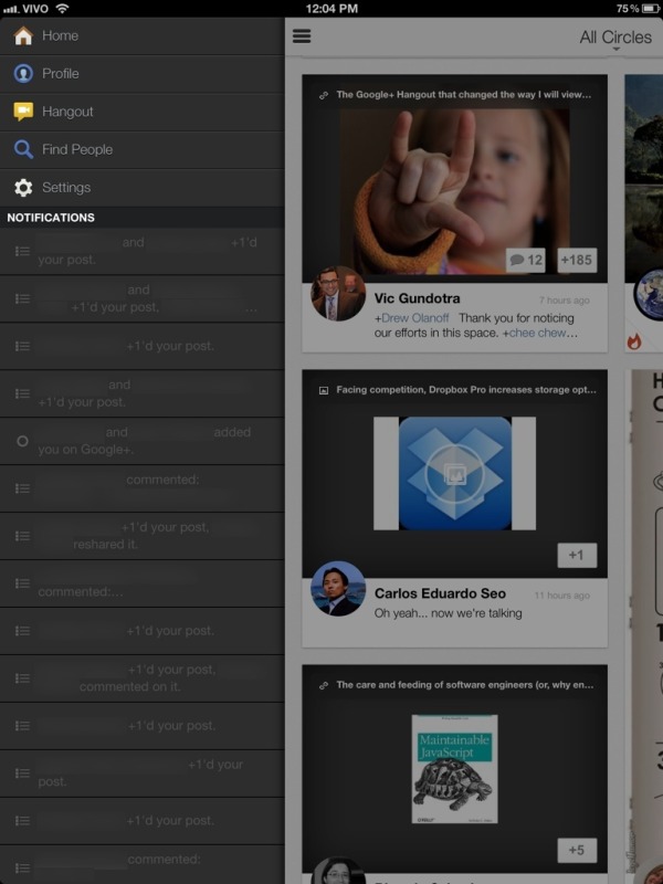
The layout and navigation are identical to the Android app. The Notifications on the sidebar are smart, and it’s easy to access all the features: Hangouts, search, settings, profile, etc. Some missing features (which are present in the iPhone app) are the Messenger and Events. Maybe Google will add these in a later release.

Notifications are displayed on the sidebar.
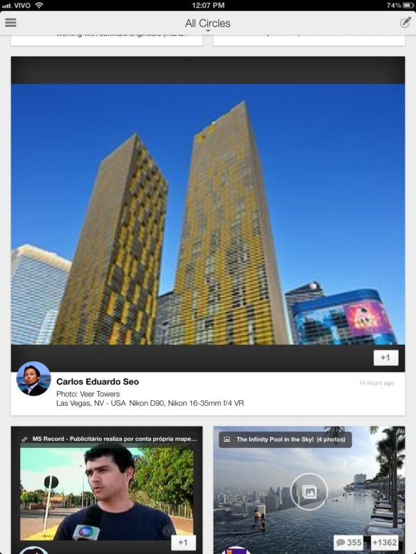
One problem I see is that, since there isn’t too much content out there prepared for high DPI (read: Retina) displays, the automatic post layout may create some horrible, stretched, pixelated images. For instance, yesterday I posted a link to a Flickr photo. Now, the preview shown in Google+ (which I don’t know if it’s picked by Flickr or Google) is a small 150×99 pixels image. It shows correctly on the web interface, but on the iPad, it gets stretched to about 10x that in width, which doesn’t yield very good results. This is something that could be improved, since high DPI displays seem to be the trend for the near future.

Some photos may look ugly on Retina Displays.
All-in-all, I think this app is very good. It hasn’t crashed once (something I can’t really say about other Google apps) and it really looks it was developed for a tablet, and not just a blown-off version of a phone app. And it’s much more pleasant to use than Facebook on the iPad.
Rating: 4.5/5.0